


Elemental Expressions
Explore the interplay between emotions and artistic mediums, unlocking the beauty of renewal through art therapy.

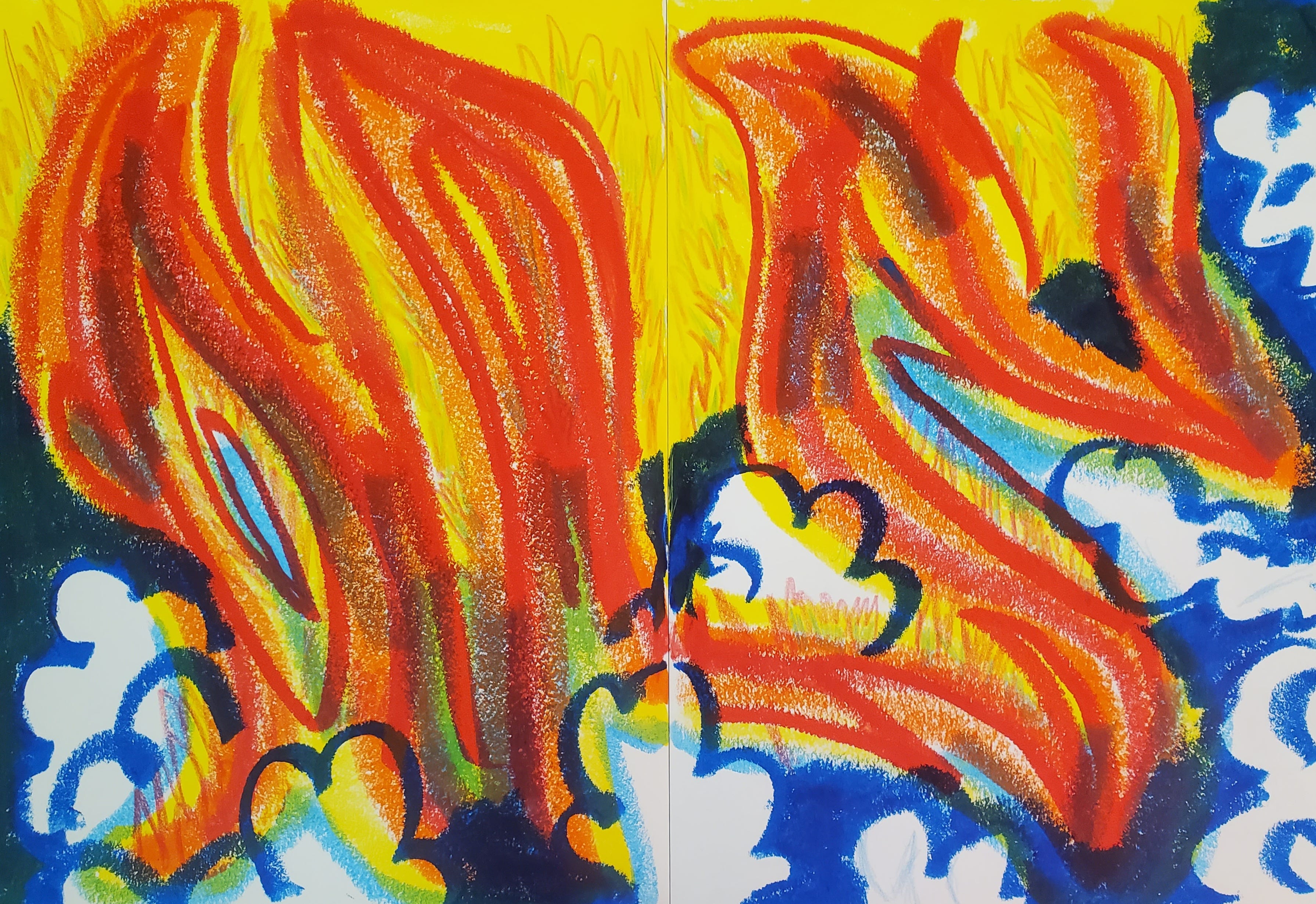
Fig. 1 Embers of Passion, paint stick in a sketchbook. ©Theresa Slater 2023.
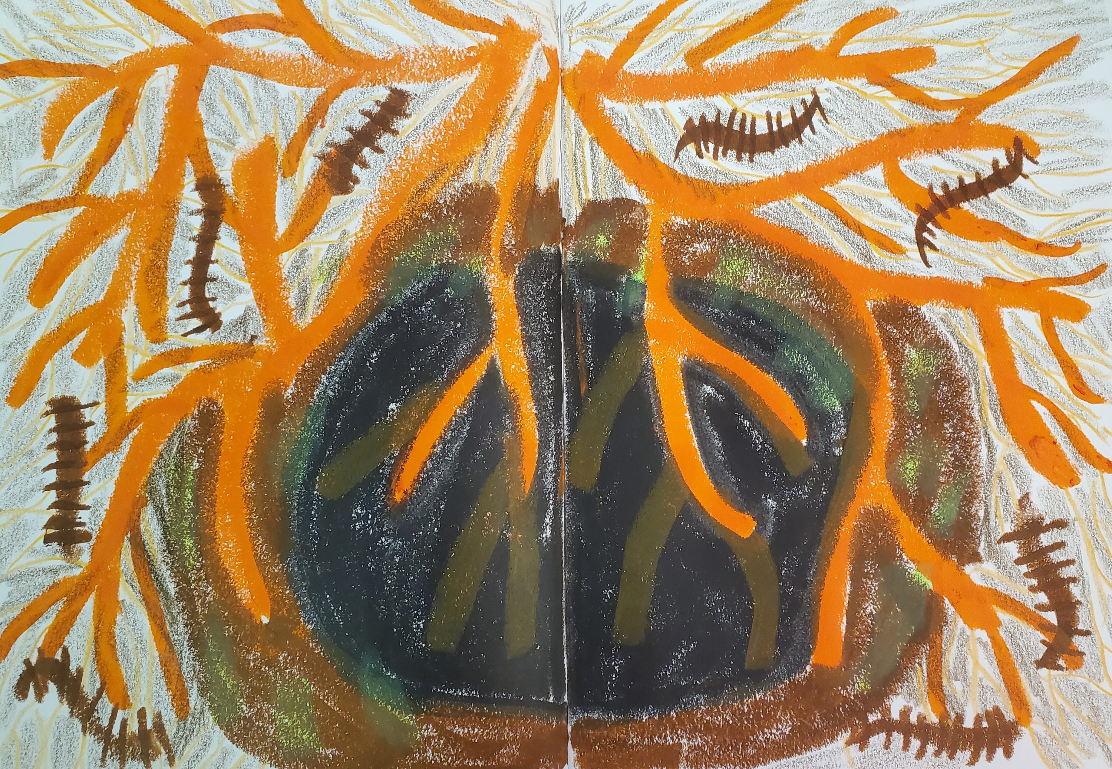
Fig. 2. Ancestral Roots, paint stick in a sketchbook. ©Theresa Slater 2023.
Invitation: “Elements”
The invitation was to draw your favourite or least favourite element (fire, earth, air, water). When we think of elements, we must understand they have a continuum – calm to fury. We were invited to create with any medium, so I chose paint sticks.
My favourite element was fire [fig. 1]. The image is four large red flames, with smaller flames behind them, trying to show the scope of the fire. It is enormous. There is dark blue around the bottom and the sides, which is overpowered by the yellow light of the flame. It’s not clear what the fuel for the fire is, but I imagine it’s all the breakup letters I haven’t dared to write. The white smoke billows. It’s cleansing; all that heartache billows into the sky.
My least favourite element was earth [fig. 2]. When a tree is uprooted because it’s fallen over, it leaves a hole like a burial spot. All our ancestors' bones are tied into those roots. It awakens critters that avoid the light and live of carbohydrates like hair and skin. I know I’m supposed to find the ground comforting, but it’s so cold and damp it reminds me of how limited our time is alive. The earth is my origin story; I come from the earth, being attached to it, and can’t leave it – its teether is as long as my life and forever afterwards. Positively, the earth symbolizes fertility, abundance, nourishment, dependability, and security.
Reflecting on my creation, I am embarrassed at how little care I took to draw flame realistically. Instead, I wanted to illustrate how all-encompassing and enormous the flame of my heart is. I felt protected and like a wielder of magic, knowing the flame's destructive forces are fodder for growth and renewal.
What is your favourite element among fire, earth, air, and water? Why does it resonate with you?
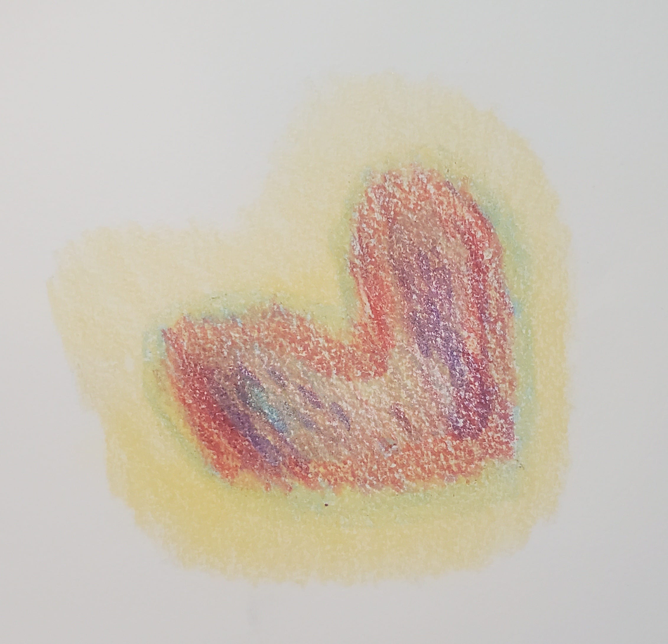
Fig. 3. Heart-shaped Bruise, hard crayon on watercolour paper. ©Theresa Slater 2023.
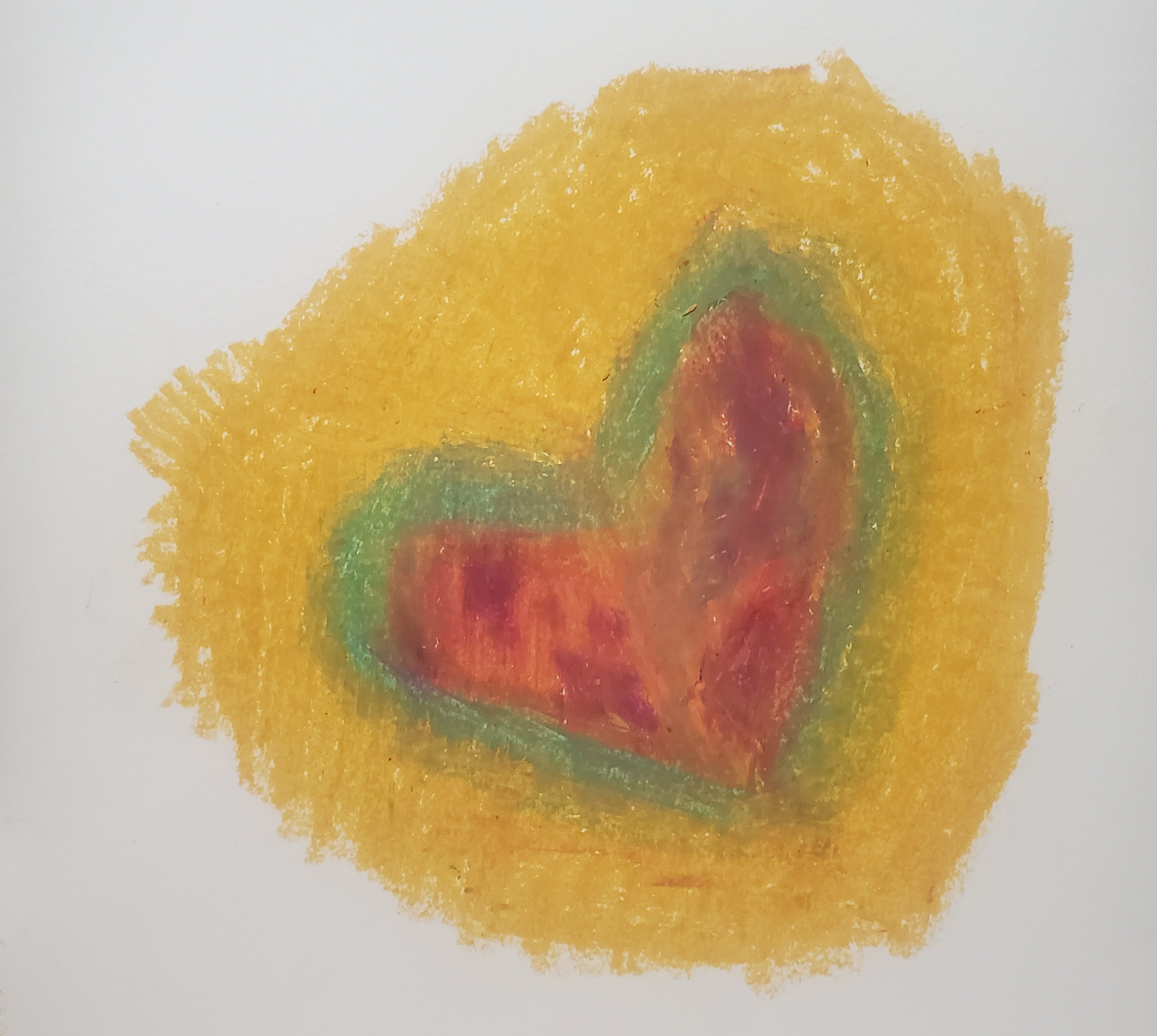
Fig. 4. Heart-shaped Bruise 2, oil pastel on watercolour paper. ©Theresa Slater 2023.
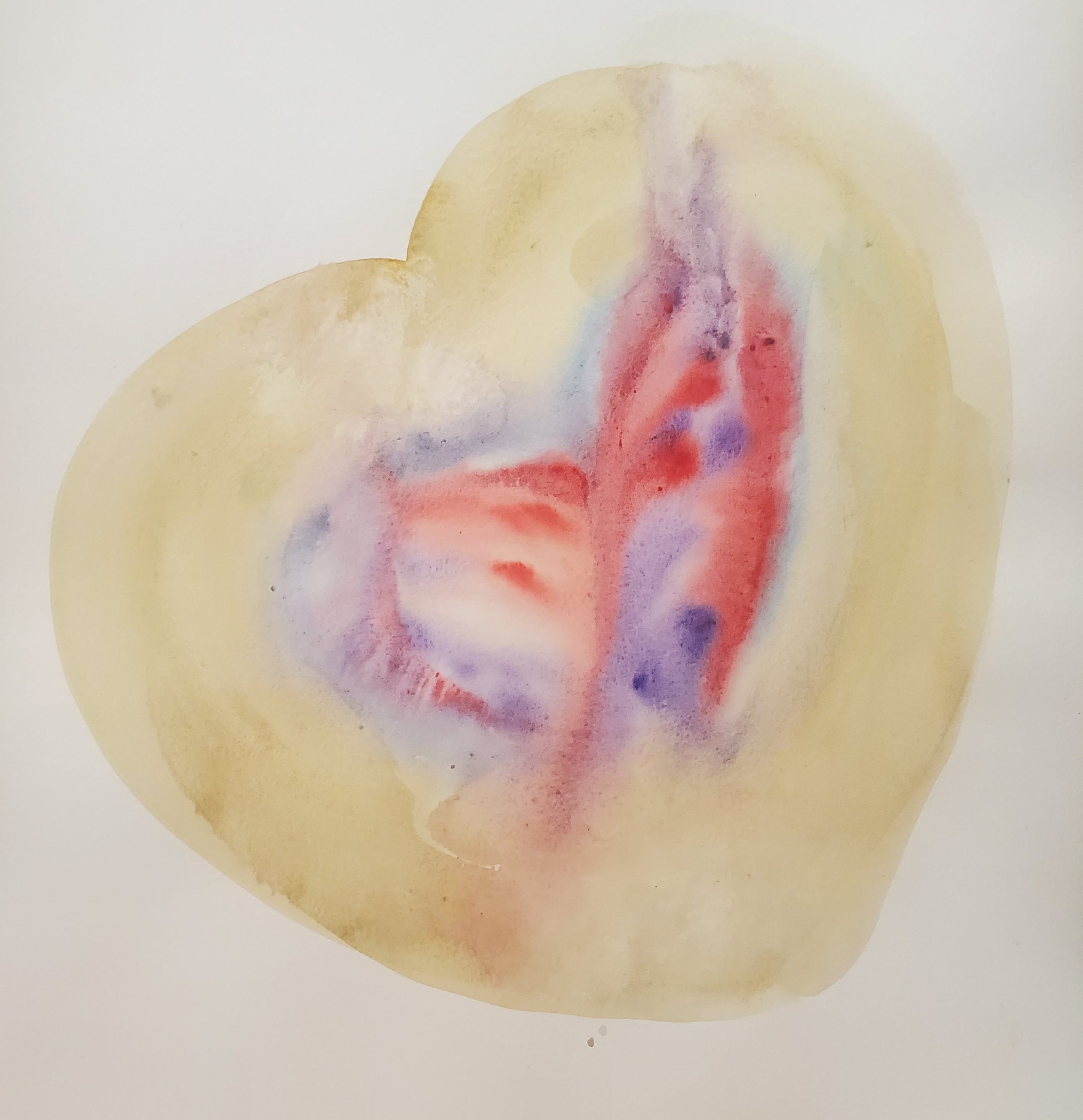
Fig. 5. Heart-shaped Bruise 3, watercolour on watercolour paper. ©Theresa Slater 2023.
Invitation: “Emotion in 3 media”
The emotion I chose to illustrate is tenderness, a complex of sadness, fear, love, hurt, and sympathy. My heart is very tender these days, and these artworks are tokens of that. We were asked to use hard crayons, soft oil pastels, and fluid watercolours to convey the emotion. The intent was to consider how the fixedness or fluidity of the medium contributed to our expression. We were invited to spend a minute describing the image without interpreting it. This will be helpful in practice, where we allow the artist to interpret, and we lead by only describing what we see, not what we think it means.
Crayon [fig. 3]
I used gold as a skin colour. The heart has a light blue outline, a dark red thicker outline, and a blue and purple center. The purple in the center is spotted. I worked quickly and with a lot of pressure. I kept the image small because I knew crayons were hard to cover the page. It would be best to use a lot of pressure with these crayon pencils - it felt like I was bruising the page.
Oil Pastel [fig. 4]
The heart shape is a little more explicit as opposed to implied. I used a blue outline, and a yellow ocher gives it a nice green tinge. The center flesh is red and spotted with purple. I scribbled yellow ocher over the whole thing to blend the colours. The media was quick and scratchy. It was easy to get good coverage, and blending the oil pastels brought a lovely muddy brown to everything. The blue, though, went a bit too green. I didn’t feel like I was bruising the paper. Instead, it felt like I was covering it up, like a band-aid, as I covered everything with a yellow ocher.
Watercolour [fig. 5]
The watercolour palette blue was out; I only got one line out of it. I used the blue to outline the heart. The inside is a wet-on-wet technique with red and purple. It’s a much more vibrant bruise than the dry media. I loved loading the brush with wet paint and applying it confidently, knowing each mark would bleed into the rest. Watercolour is very forgiving if you use wet on wet, even wet on dry; if you make a mark you don’t like, you can pick it up with water. I could have mixed it more to make it brown, but it would look like I had a muddy palette. This doesn’t read as realistic as the other two because the colour is too unnatural. The red and purple swirl reads like pooling blood under the surface, just like a bruise.
The underlying assumption of this invitation is that the media will change the expression of the feeling, and it did. The crayon required so much energy and pressure. The oil was fluid but still very defining. By the time I got to the watercolour, much of my emotional energy was already spent, and I was open to letting the media feel my tenderness.
Have you ever used different art mediums to express your emotions? How did the choice of medium impact your expression?
i loved the bold reds in figure 1 - they translated quite nicely to the screen.